Composition Studies for A History of Tomorrow
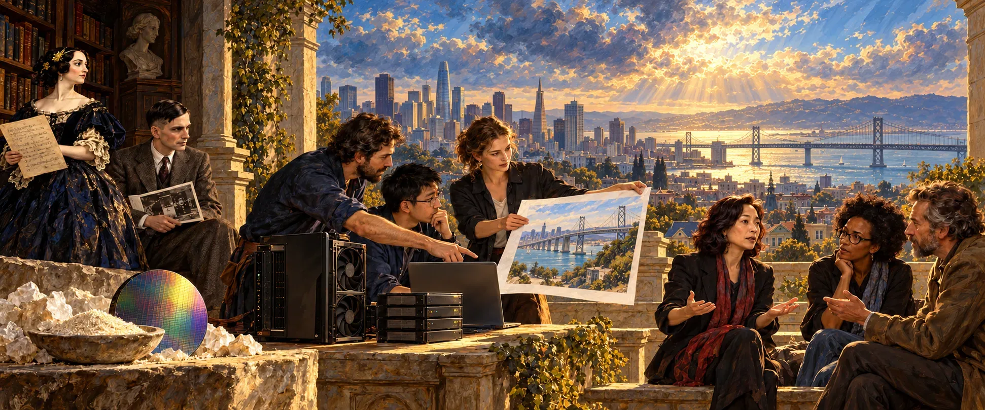
A History of Tomorrow began as seven paintings for a hallway I walk through every day. The essays came second. Each panel is composed in the tradition of history painting, large figures in a lit room with the Bay beyond, and each one carries a single idea from the series: the record, training, attention, encoding, the model as an artifact, inference, stewardship.
Before any final panel, there is a study. The one above was an early attempt at the whole series on one terrace over the city: Ada Lovelace at the far left holding a manuscript, Alan Turing seated beside her, the sand and a wafer on the stone, and the people of the present arguing at the right. It set the register for everything after it. It also showed the problem the rest of the process exists to solve.
A picture that looks right
A painting teaches as fast as a paragraph, and it is much harder to correct. So every study gets a written brief before it goes further. The brief names each figure and the reason they are in the room, lists the objects from foreground to background, describes the one diagram the panel is allowed, and ends with factual constraints that the finished painting has to meet.
The studies kept failing in small, specific ways.
- Training. The study drew the ImageNet error rate as a smooth curve falling from 2010 to 2012. The point of that panel is a discontinuity. In 2012 the winning entry reached 15.3 percent top-5 error against 26.2 percent for the runner-up. The chart has to show a cliff.
- The Human Record. Several studies placed the Bay Bridge in the window. From the Richmond or the Presidio you see the Golden Gate Bridge, and you cannot see both from the city side at that angle. The viewpoint has to be chosen before the painting.
- Transformers. The panel shows two cards, one about a flood and one about an audit, with threads of light from each “bank” to the word that resolves it. Image generation tends to add extra threads. Every extra thread teaches something false.
- Encoders. This study got the arrows right, where an earlier sketch had an encoder emitting a phrase. Its view of Angel Island and the Marin hills, with no bridge, matches the city’s north side. It is the one study whose geography needed no correction.
The first Training brief also went wrong in a way no fact check would catch. It made a technician replacing a failed graphics card the focal action. I rejected it as a portrait of manual labor at the point of failure, smaller than the series intends. The study I made instead sets the panel in a Toronto lab in winter, at the moment in 2012 when the chain from sand to a learned system first closed in public.
What it taught me
The rule that came out of this is simple. Every diagram inside a painting is rebuilt as an exact vector graphic and composited in. Nothing that carries meaning is left to a brush or a generator. The paint holds the room, the light and the people. The diagram holds the claim.
That is the same split I have worked with for most of my career, between the surface people feel and the structure that has to be true. A history painting turns out to be a product with one screen and no undo.
The final panels are next. The studies currently stand in as the plates at the top of each essay.