The Huffington Post
Athena, the newsroom's publishing system, and the Realtime news app.
From August 2014 to August 2015 I was a senior UX designer at The Huffington Post in New York. It was a time when the homepage mattered. Headlines were loud, imagery was direct, and every story had to cut through a noisy, distracted day. Most of my year went into the tools behind that page: Athena, the system the newsroom used to write, illustrate and publish, and the apps that carried the stories out.
Athena
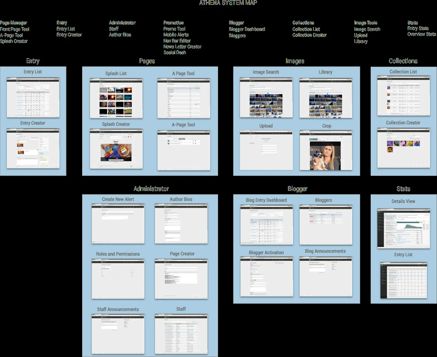
I mapped all of Athena, every module from the entry creator to page building, collections, image search, administration, blogger tools and stats, so the team could see the whole system before redesigning any part. In November 2014 a style guide gave those modules one visual language.
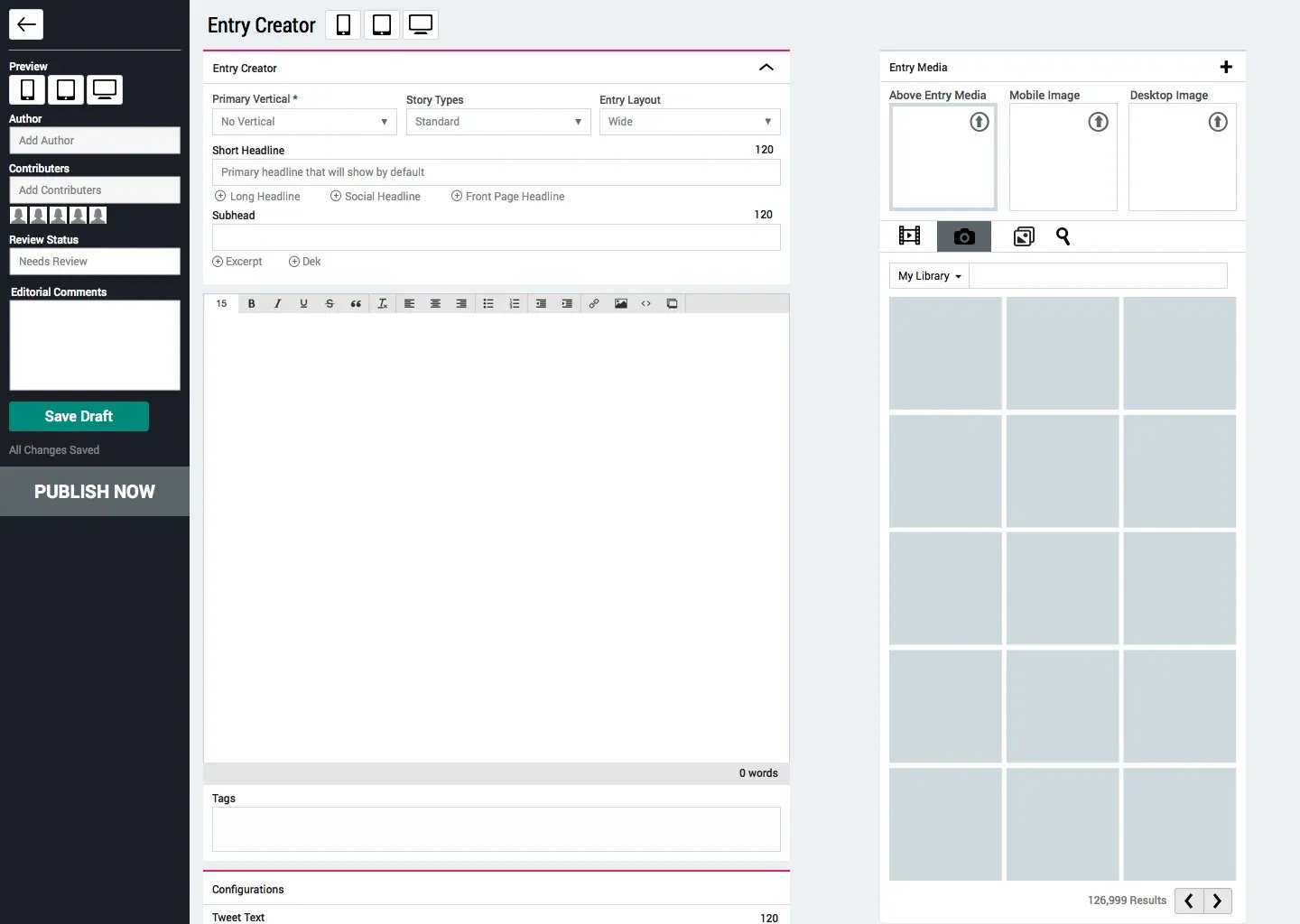
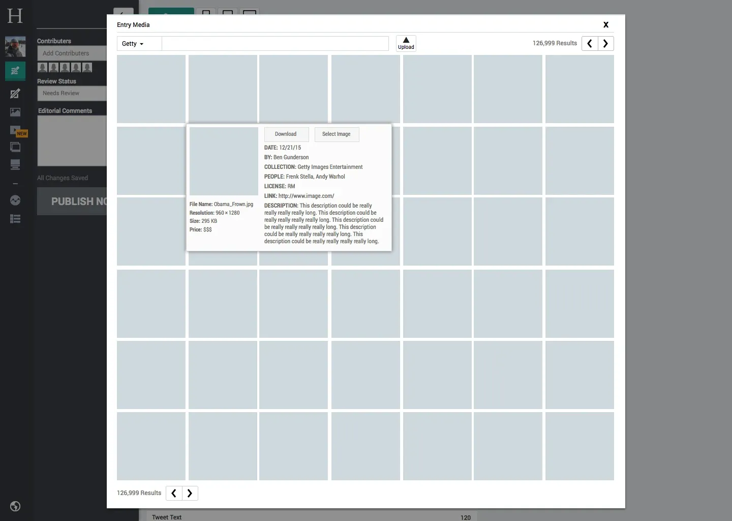
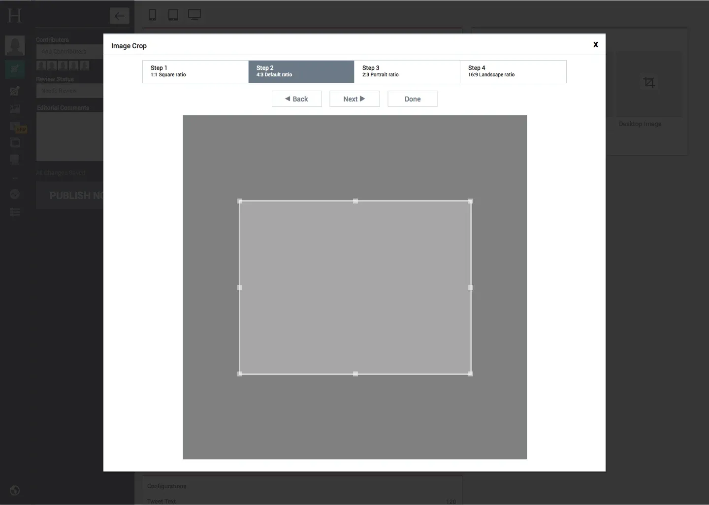
The Entry Creator is where a writer spends the day. The story is written in a single column, with a media panel beside it, so images and embeds are found and added without leaving the draft. Image search shows the metadata an editor needs before choosing, such as the credit, collection and licence. A four-step crop sets each of the image’s ratios once, so one photograph can serve several layouts.
Around the editor sat smaller tools: an alerts creator for push, Twitter and email alerts, and a stats dashboard that let writers see how their stories and their team’s stories were performing, what was trending, and how they might share their work.
Realtime
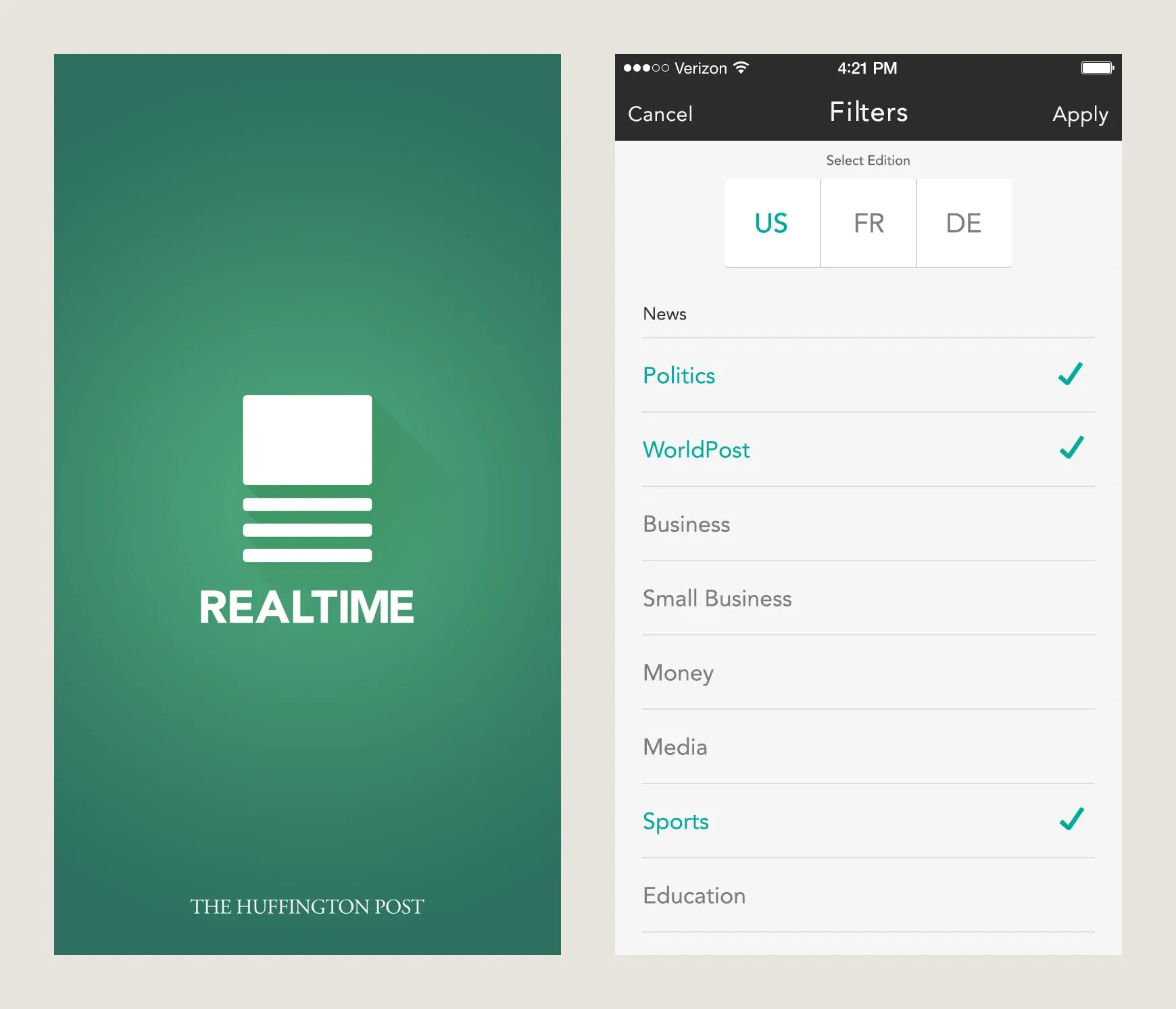
Realtime was the news app for iOS and Android. Readers could choose an edition, follow or hide topics, favourite articles and save them for later, and get alerts when a story broke. I designed the app’s screens and specified them for engineering, and explored a speed-reading mode that opened from a pull tab inside an article.
In 2015 I also helped art direct the redesign of the desktop and mobile websites.
What carried forward
Athena taught me that the people who make a product’s content are its first users. A newsroom moves at the speed of its tools. Every step taken out of the editor showed up as time given back to reporting, and that idea has run through my work since, from New York Magazine’s Composer before it to the dashboards I designed at Facebook after it.