IKEA.com at McCann
A redesign of how people browse IKEA.com: shop by room and by size, category templates, and an early concept for seeing furniture in your own room.
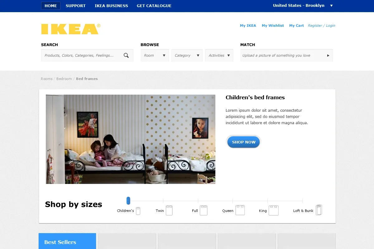
From August 2011 to May 2013 I was a UX designer at McCann Erickson in New York. My largest project was a redesign of IKEA.com, which ran from August 2011 to February 2012 with a small team across McCann New York and MRM Stockholm.
An IKEA store is built for wandering. People move through rooms and find things they did not come for. We wanted the website to keep the feeling of walking through rooms: clear sections with visual anchors, products grouped the way they live together, space to breathe between steps, and a logical architecture behind it all.
Finding the way in
The work started with the people shopping. I set out what they needed at each stage, such as planning a room, comparing products and reading reviews, and reorganised the catalogue so it could be browsed two ways, by category and by room.
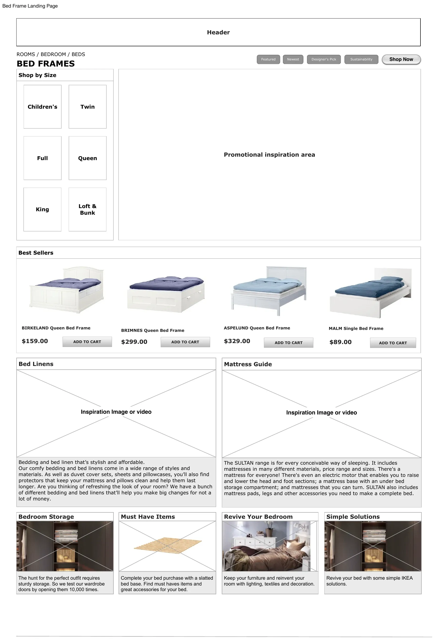
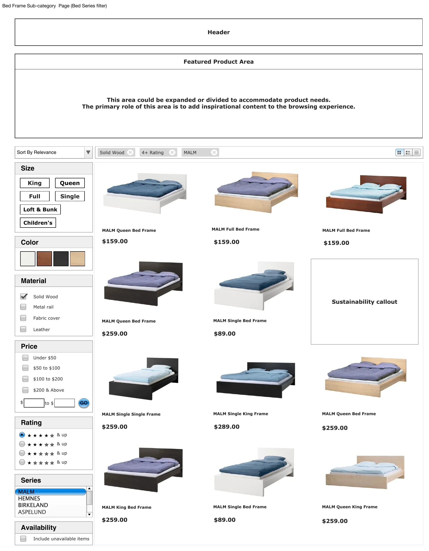
Beds were the first journey we worked through in detail. A bed is a big decision with a lot of variables, so the bed journey began with the question people actually ask, which is what size. From the landing page a shopper could choose a size, see the best sellers, and read guides to bed linen and mattresses before narrowing by size, colour, material, price and rating.
Templates for every room
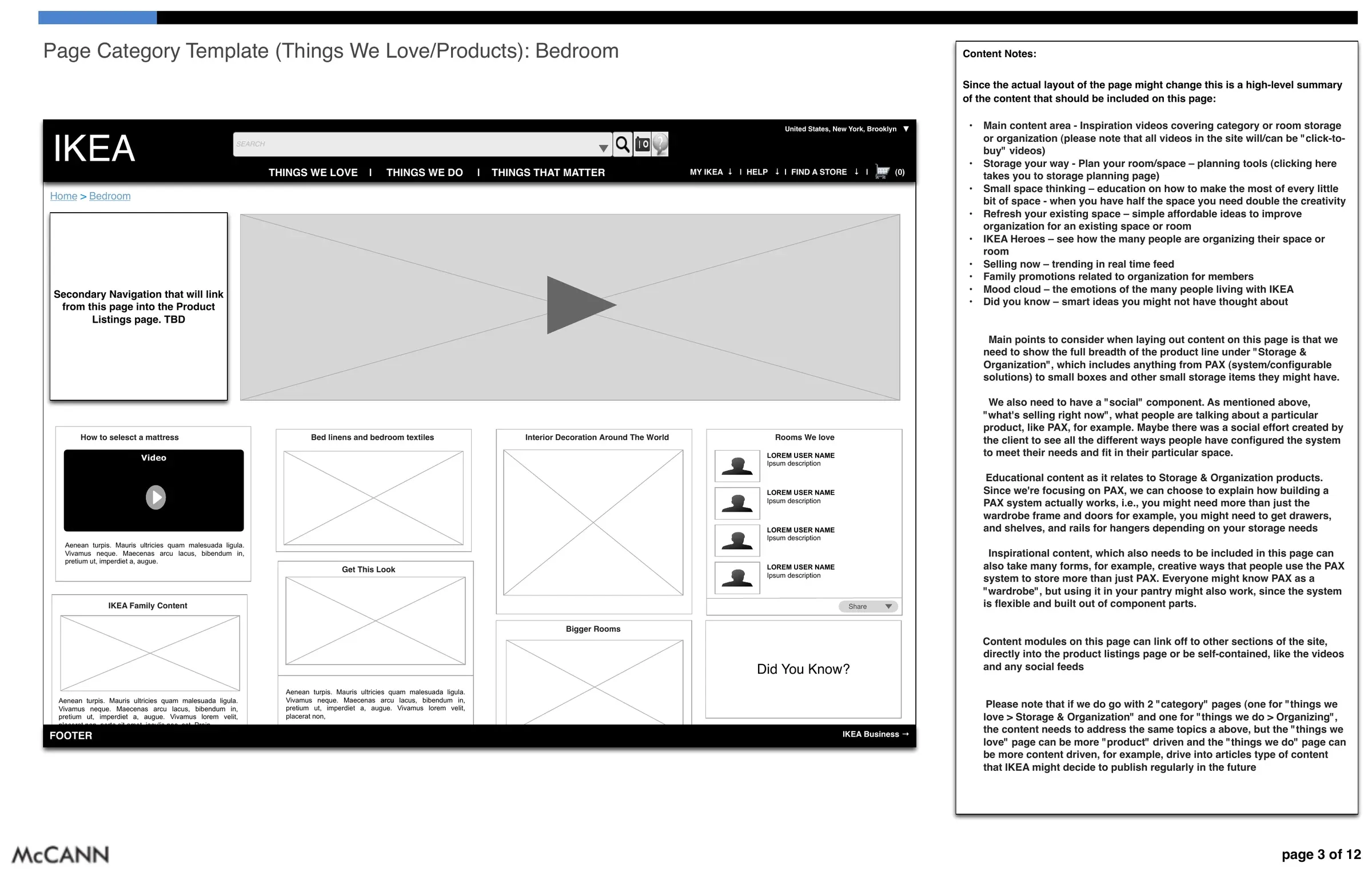
The third round of wireframes, in January 2012, turned those journeys into templates that could carry any category. The bedroom template mixed inspiration and product: a video, things the IKEA team loved, simple solutions, and the products themselves, each section annotated so the template could be reused across the catalogue.
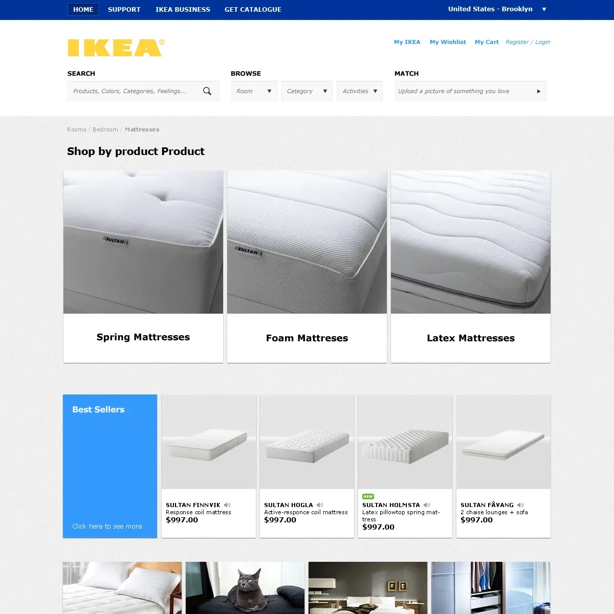
The visual designs brought it together. A new header put three ways to start side by side: search for a product, browse by room or category, or match, by uploading a picture of something you love.
See it in my room
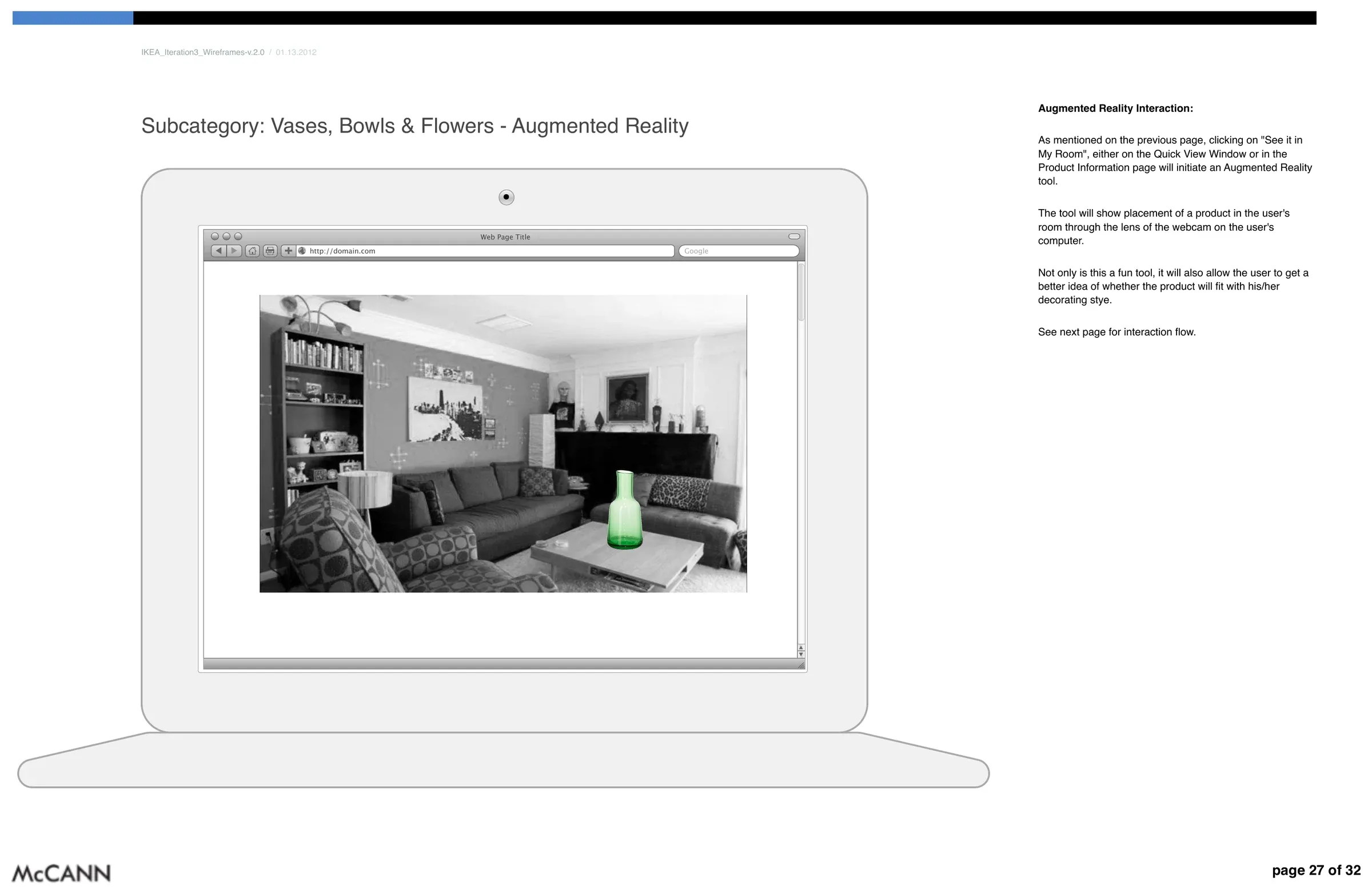
The most forward-looking piece was a concept called See it in my room. From a product page, a shopper could turn on their webcam and see the product placed in their own space before buying it. It went through the third and fourth rounds of wireframes as an early idea for the website. IKEA went on to ship augmented reality in its apps.
Other clients
Between IKEA rounds I designed information architecture and user flows for other McCann clients, including Merck, Verizon, Nikon, Meetup, PF Chang’s and L’Oréal.
What carried forward
IKEA was where I learned that structure is a design material. The categories, the templates and the order of a journey shape a shopping trip as much as any screen does, and that idea has stayed at the centre of how I work.