Guggenheim Museum
Web and print design for the Solomon R. Guggenheim Foundation: the New York home page, accessibility, annual reports and analytics.
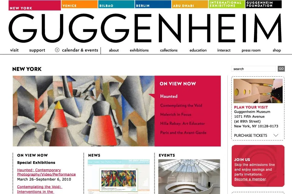
From January to April 2011 I was an assistant interaction designer at the Solomon R. Guggenheim Museum in New York, on the team that ran the foundation’s websites. The building itself is an inward spiral, an architectural gesture toward slowing down and looking closely. Online we leaned into the same idea: quiet layouts with few distractions, a rhythm of content that rewarded slow exploration, and focused ways in.
The New York home page
I designed for web and print, and built new components in the site’s Drupal system. The largest piece was a colour and layout refresh of the New York home page, which brought what was on view, news, events, membership and the store into one clear grid under the foundation’s coloured location bar.
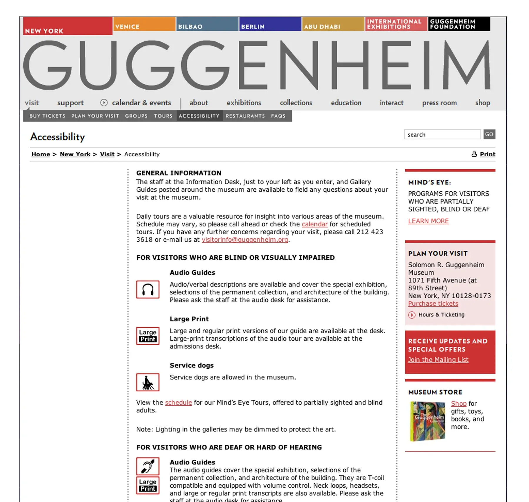
Accessibility
The accessibility page gathered everything a visitor with a disability needed before arriving, grouped by need: audio guides, large print, service dogs and Mind’s Eye programmes for visitors who are blind or partially sighted, listening devices for visitors who are deaf or hard of hearing, and entrances, wheelchairs, restrooms and elevators for visitors with limited mobility.
Print on the web
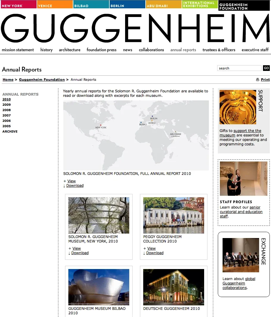
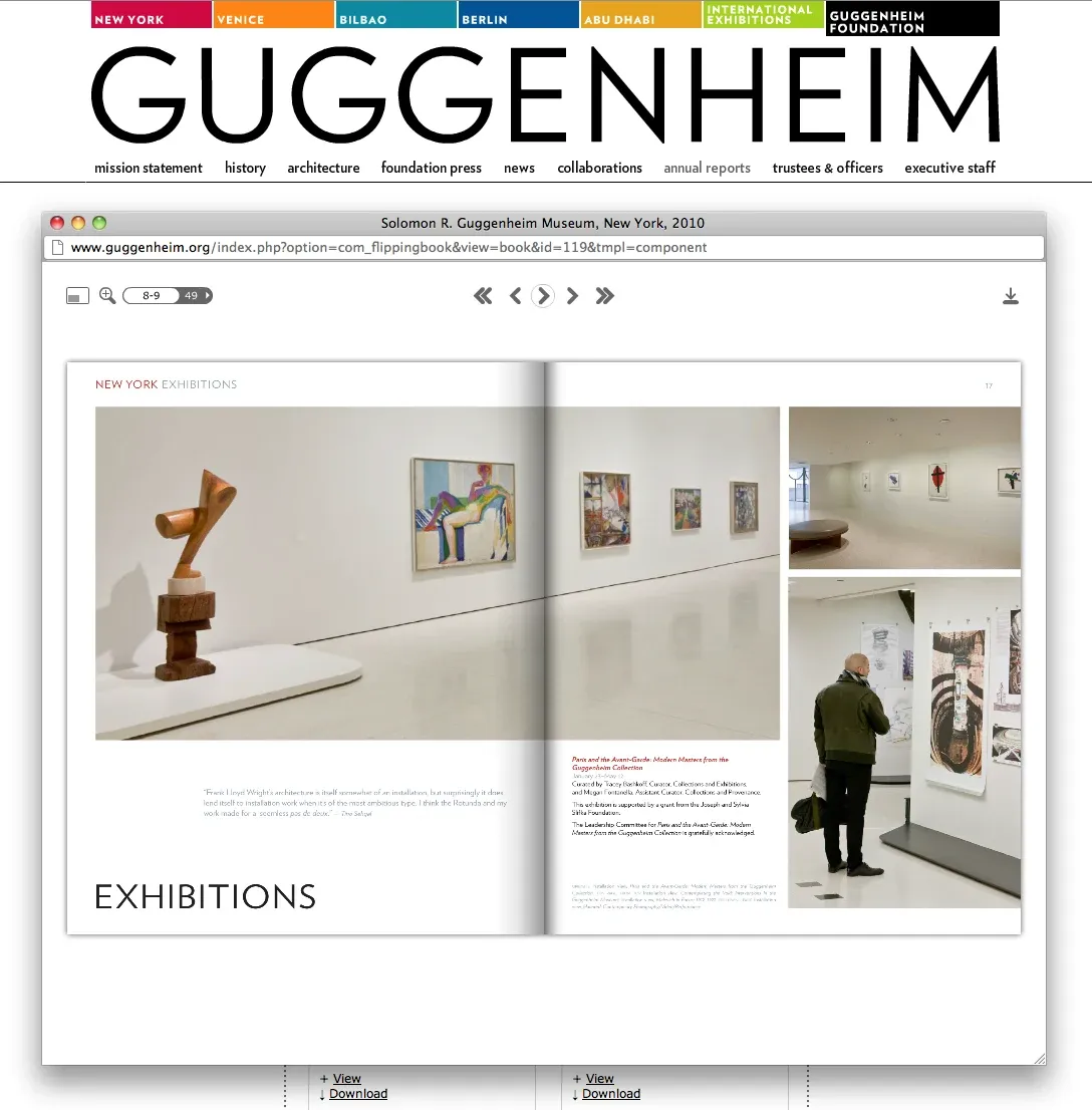
Much of the foundation’s writing lived in print. I worked on bringing it to the web, including the annual reports, which could be downloaded or read in a page-turning viewer, and checked the microsites for exhibitions and installations before they went live.
Measuring and proposing
I surveyed the site’s analytics, code quality and content performance, and wrote a naming scheme for Google Analytics event tracking so the team could see which links and downloads visitors used, from ticket purchases to visitor guides in other languages. I also wrote a cost-benefit proposal for an iPad kiosk in the museum store, so visitors could order online-only products and sign up for email from inside the museum. And I worked with Apple on Guggenheim imagery used in the promotional material for Mac OS X Lion.
What carried forward
The Guggenheim was where I learned that calm is a design decision. A page that gives a visitor room to look, and tells them plainly how to get in, does more for the museum than one that competes for attention.