New York Magazine
Composer, an editor that let writers build a story on the page itself, with live desktop and mobile previews.
From May 2013 to August 2014 I was the UX lead at New York Media, the company behind New York Magazine, Vulture, The Cut, Daily Intelligencer and Grub Street. Every page there had to balance information and story. A quote placed in the middle of a spread, or a black-and-white portrait in place of a colour photograph, framed how a reader would take an article before they read a word. My job was to give the people making those pages better tools, and to make the pages themselves work on every screen.
Composer
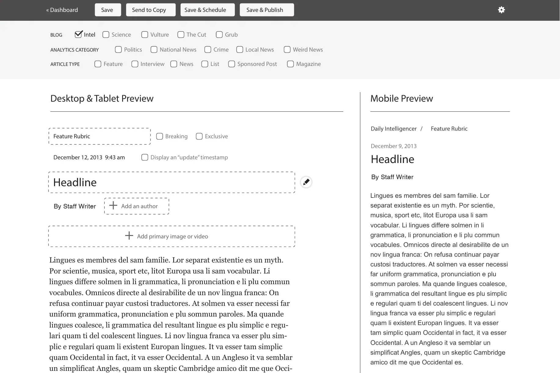
Composer, first called the Author Tool, set out to let editors build a story on the page the reader would see. In December 2013 I interviewed editors and staff about how they worked. Over the following three months I designed an editor where the story is written on the page itself, with the desktop and tablet layout on one side and a live mobile preview on the other.
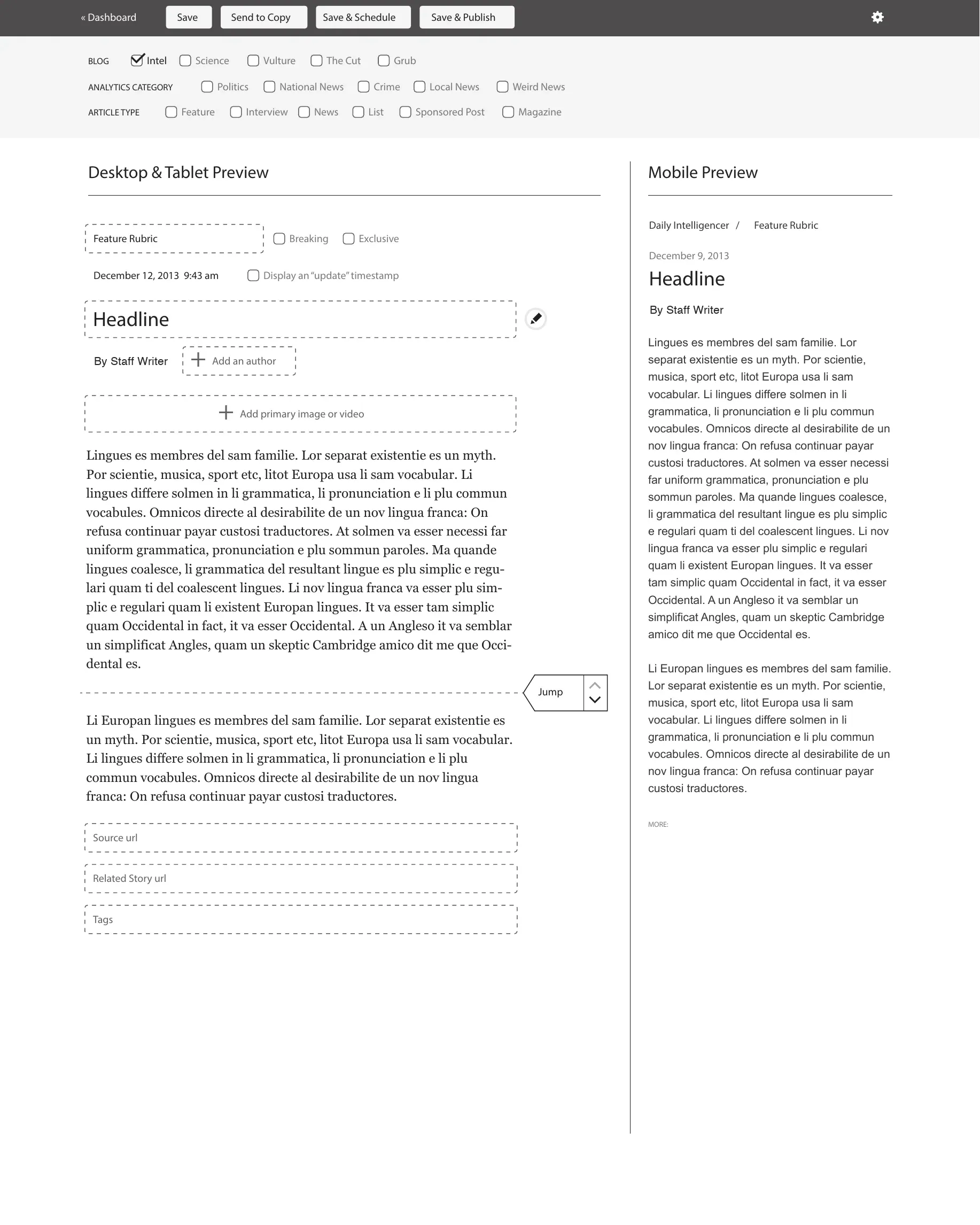
Two ideas carried the design. The writing happened inline, so a writer always saw the story as it would appear. And metadata appeared only when it was relevant to the task at hand, so the page stayed about the story. Context menus made adding media a single step. In February 2014 I built a working prototype and tested it with editors. Live mobile preview became the heart of the design. The prototype is on GitHub.
Layouts for every screen
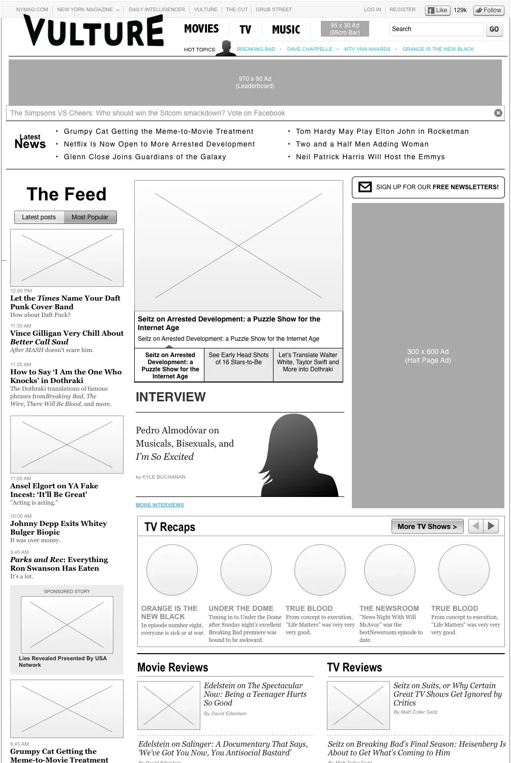
Alongside Composer I designed the responsive layouts for the sites themselves: the Vulture home page through seven rounds of wireframes with tablet and mobile versions, The Cut’s home page, and article templates for desktop, tablet and mobile. Slideshows got their own comps and an interactive prototype. The work was gathered into a pattern library, the shared home of New York Media’s style assets and standards.
Registration
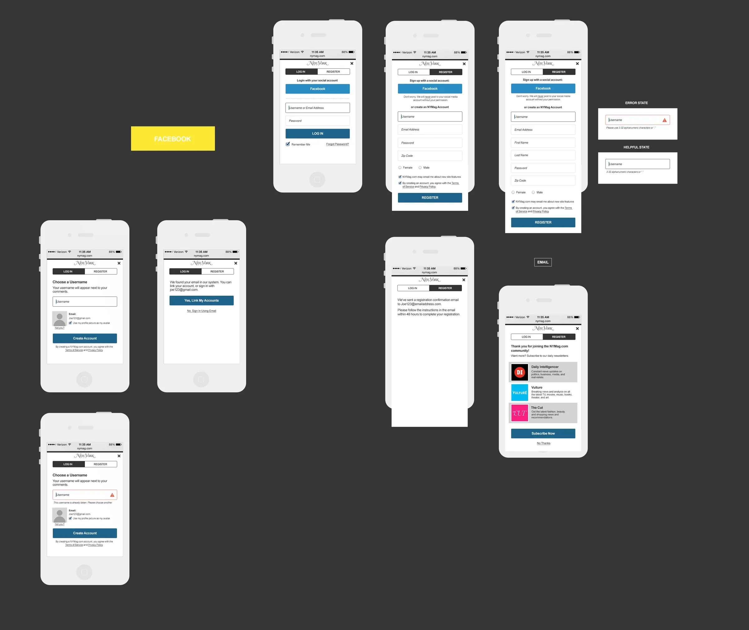
I redesigned login and registration across the sites: sign-up with a social account or an email address, choosing the username that appears beside your comments, linking an existing account, confirming by email, and clear error and helper states at every step.
The Oscars
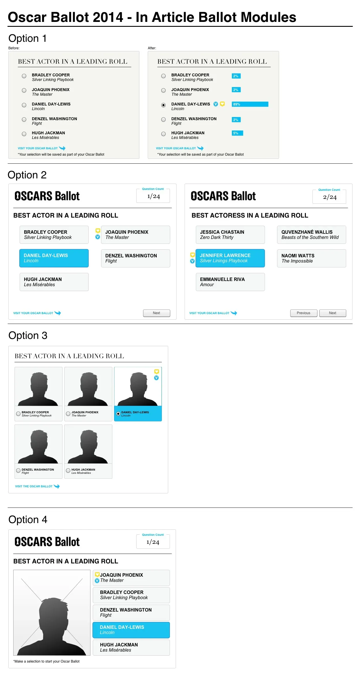
For the 2014 Academy Awards I designed an Oscar ballot that lived inside articles, so readers could make their picks where they were already reading. I took four options to the team, from a plain list to portrait cards.
What carried forward
Composer showed me the value of building the thing. A working prototype in front of editors settled questions that comps could not, and I have kept prototyping early since.